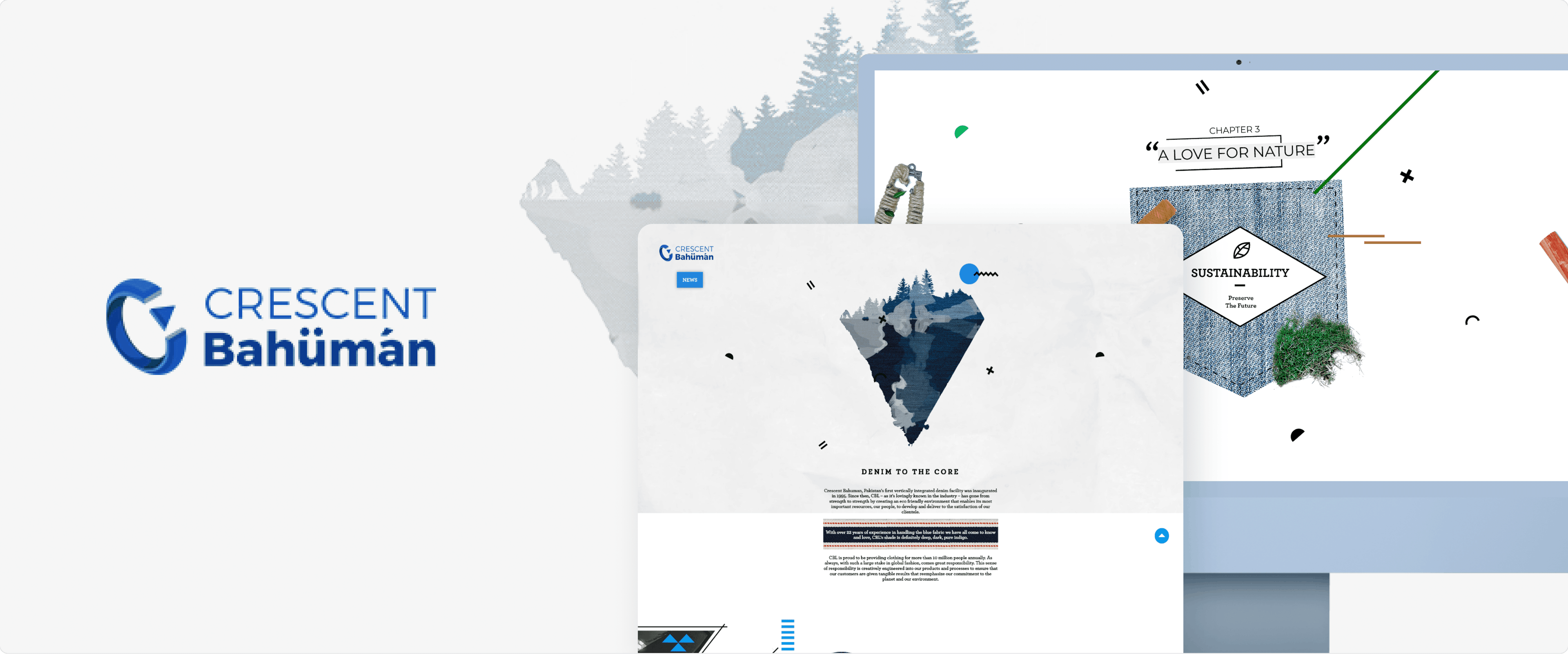
Introduction
Crescent Bahuman, Pakistan’s first vertically integrated denim facility was inaugurated in 1995.Since then, CBL has created an eco-friendly environment for its people pre-, during anfd post production. They came to us to design an artistic website to showcase all that they have accomplished, the process and facility. They wanted a platform that showcased their transparency.

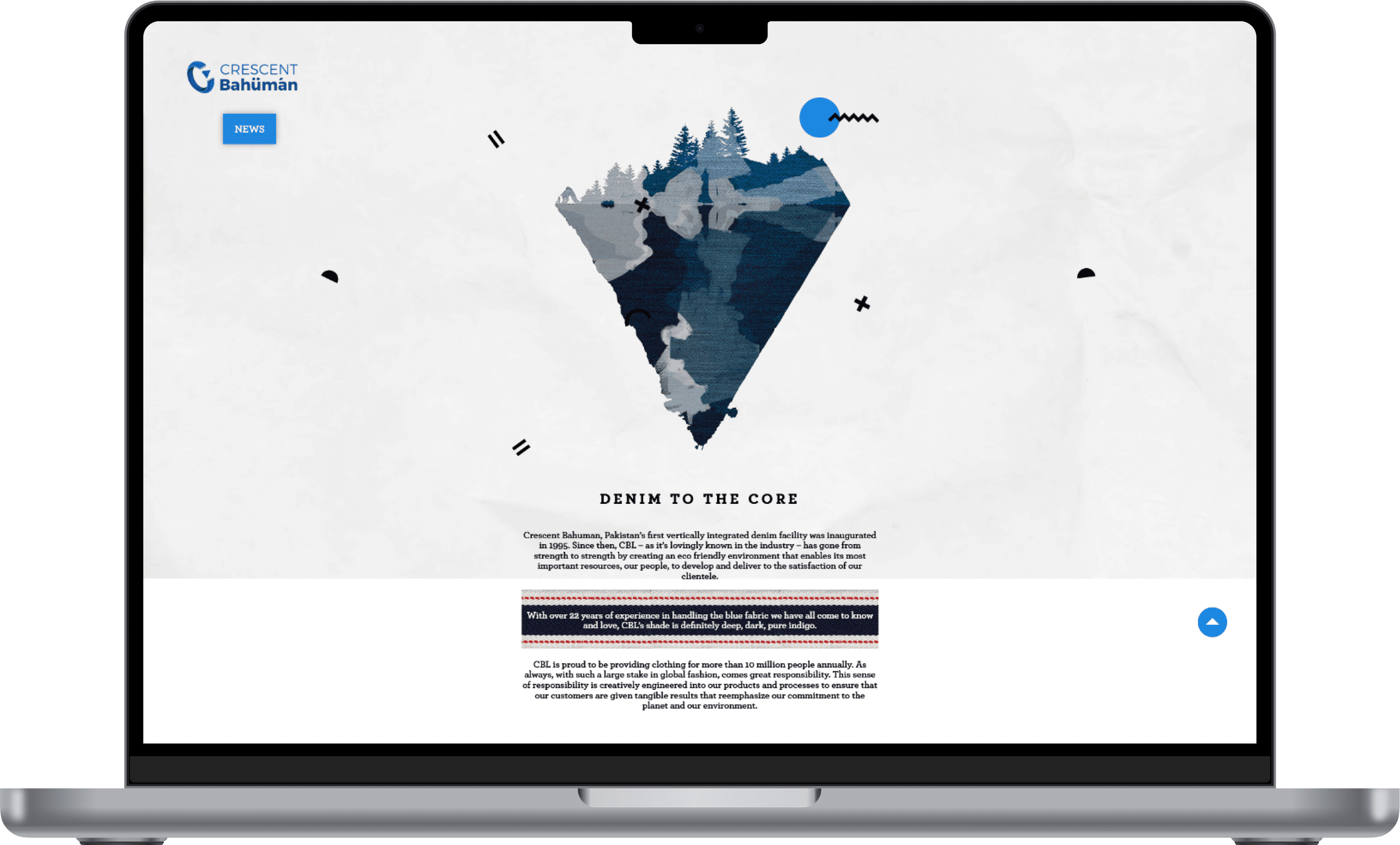
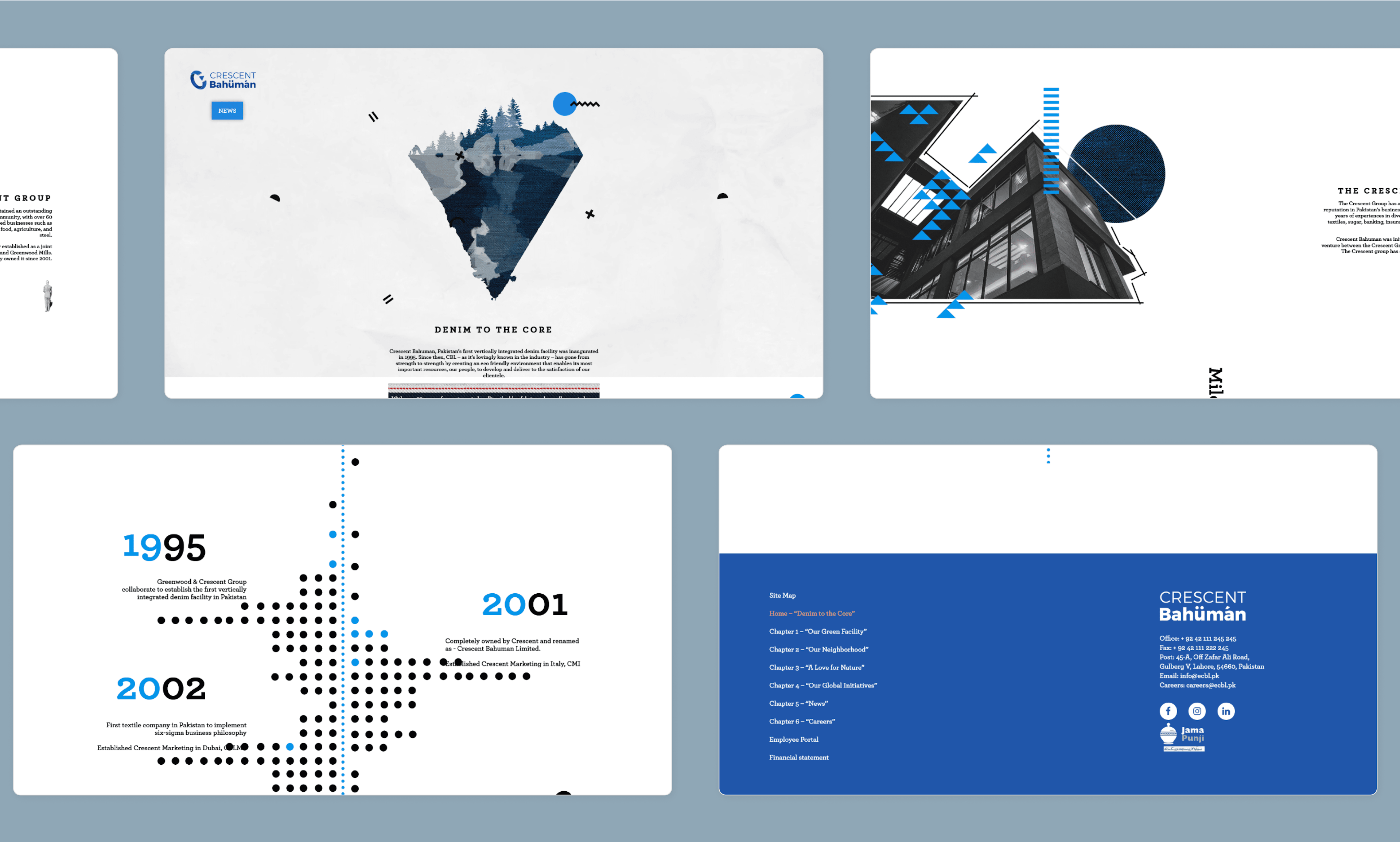
Home - Denim to the Core
The hompeage was an ode to chic minimalism. Displaying how their eco-friendly apporach masked a depth of effort and practice.The timeline of their conception and achivements, their main head office and their USP were outlined in bold relief through strategic usage of icons, their brand colors and parallax scrolling. So it is not only information but also a treat for th eyes.


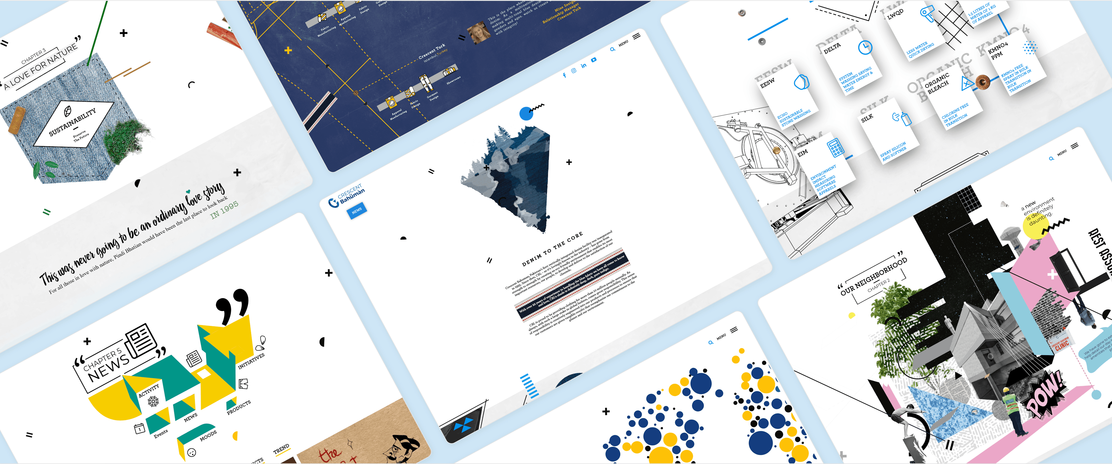
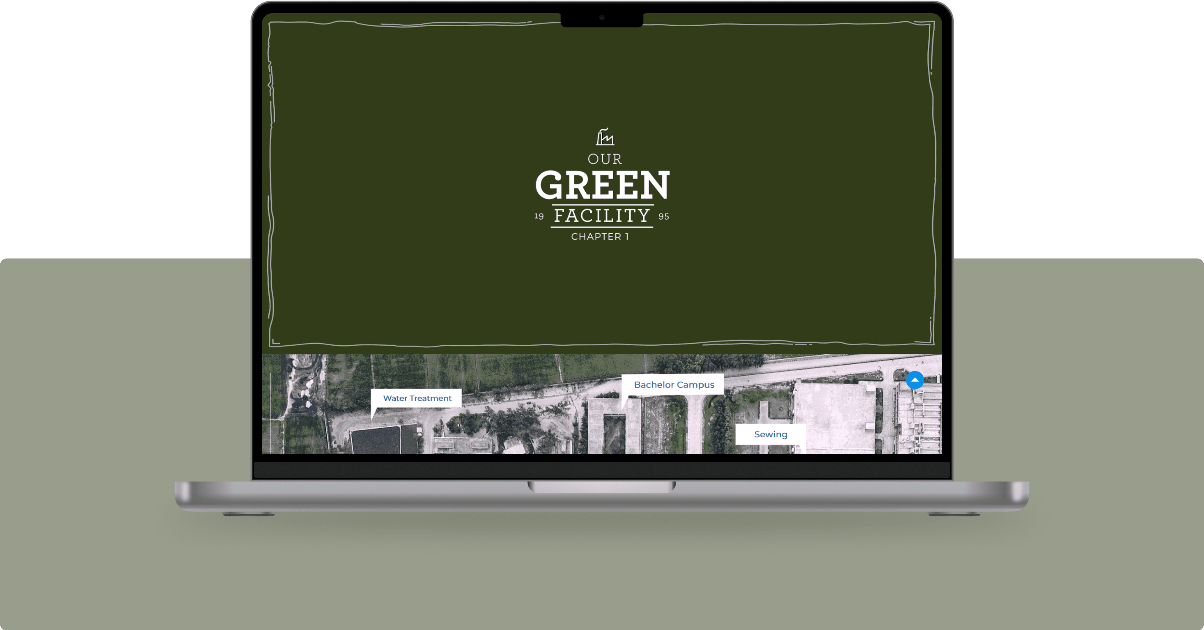
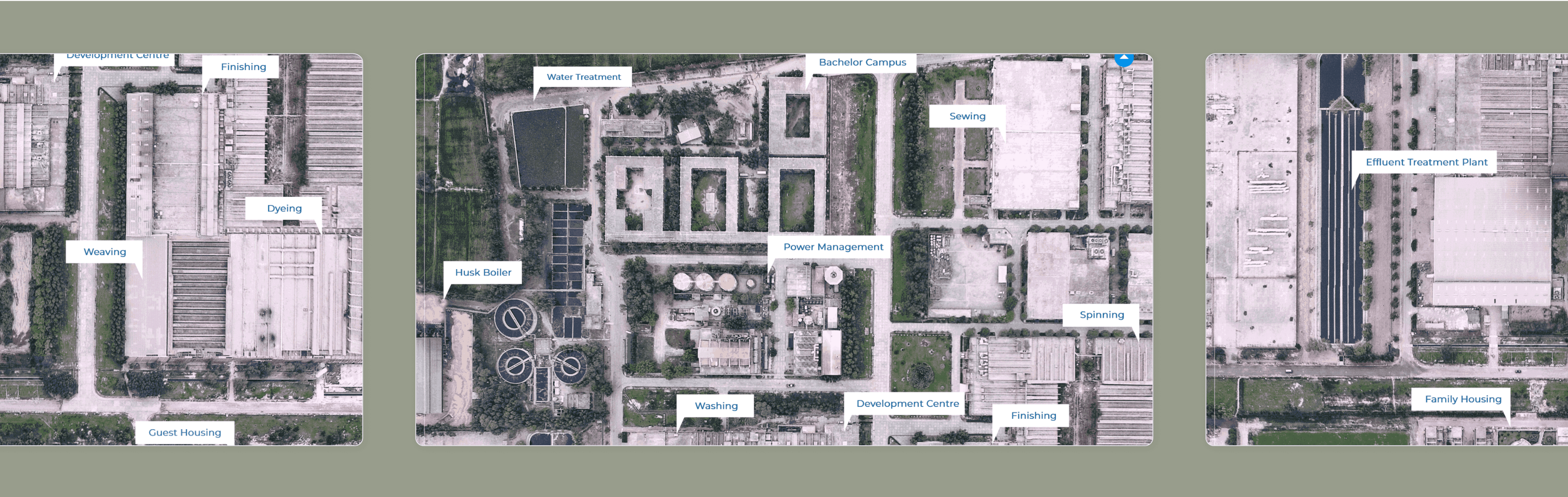
Chapter 1 - Our Green Facility
They wanted a platform that showcased through chapters the different facets of their existence. The facility is their crown jewel was chapter 1.They wanted everyone to know how they conserved water and resources in their facility to create a process that produced environment-friendly denim. Through aerial imagery, connecting text and iconography we showed how it was possible.


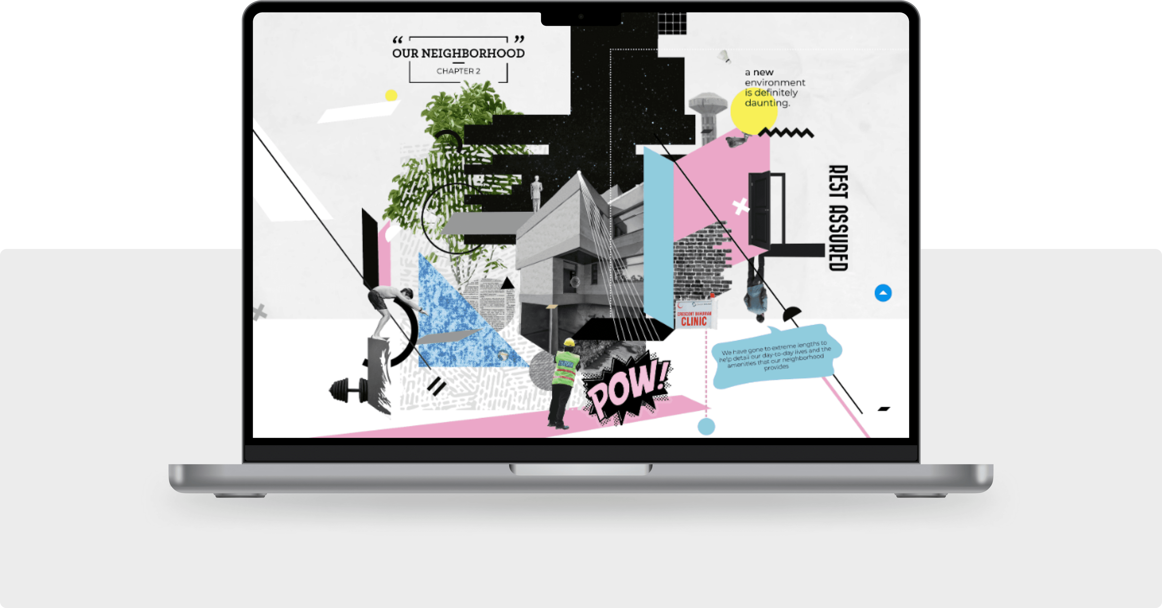
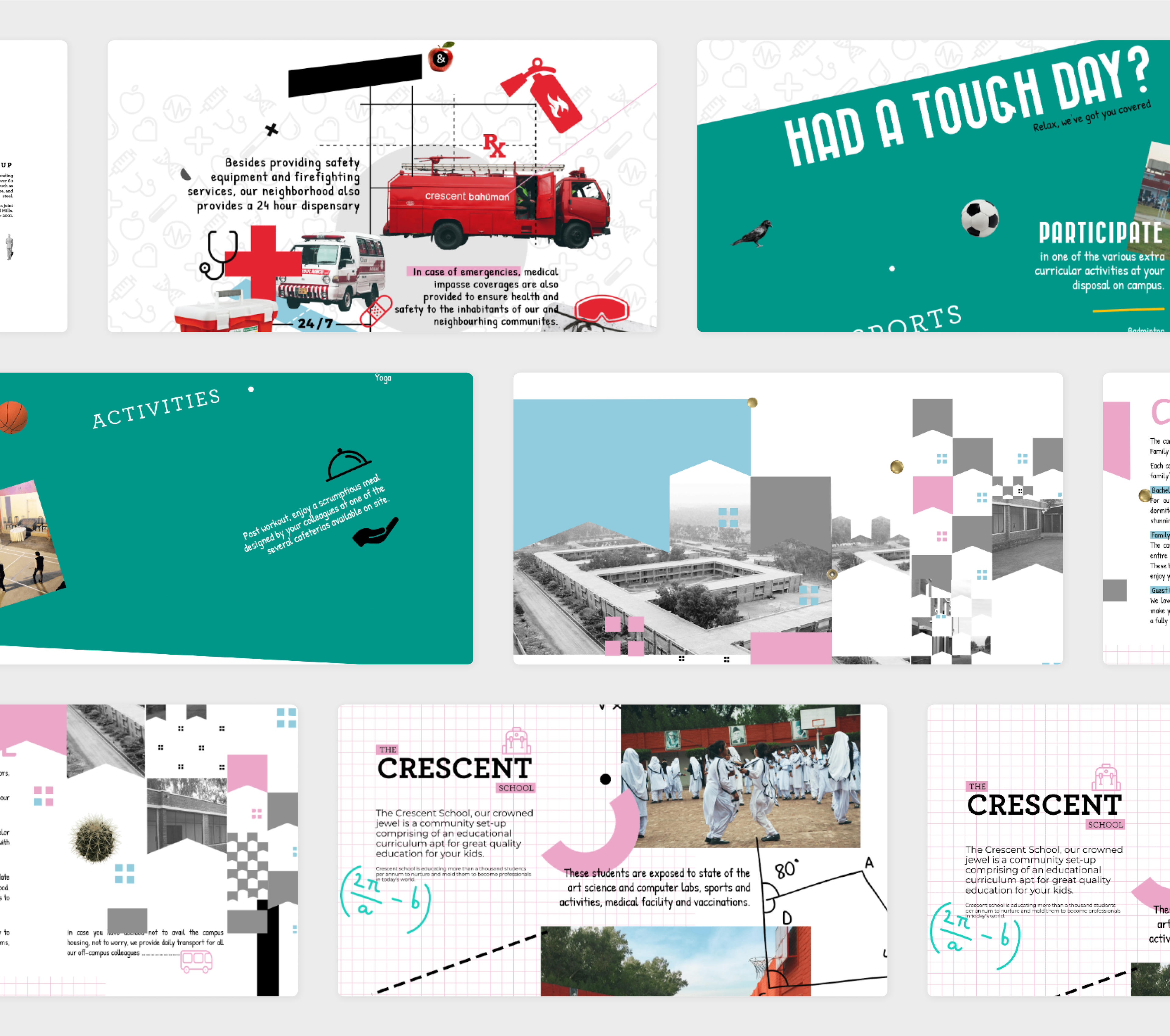
Chapter 2 - Our Neighborhood
Graphic art collages, catchy text and varied backgrounds showed how they created a vertiable village for the people who worked for them.CBL had created a cohesive village that had everything from its own fire department to schools to activities arranged to keep everyone active and involved. The school they made for the children of their employees was a state-of-the-art facility.

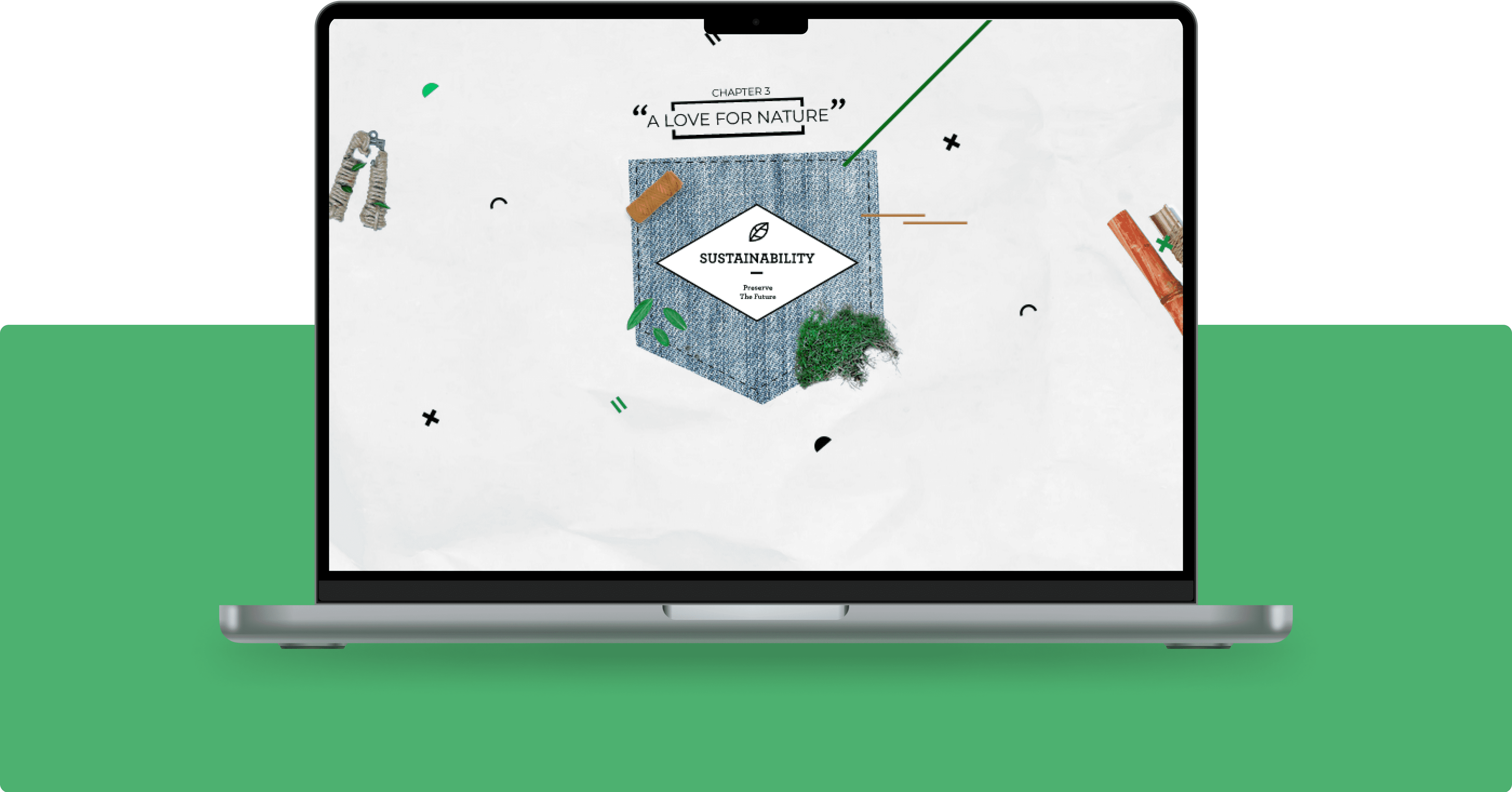
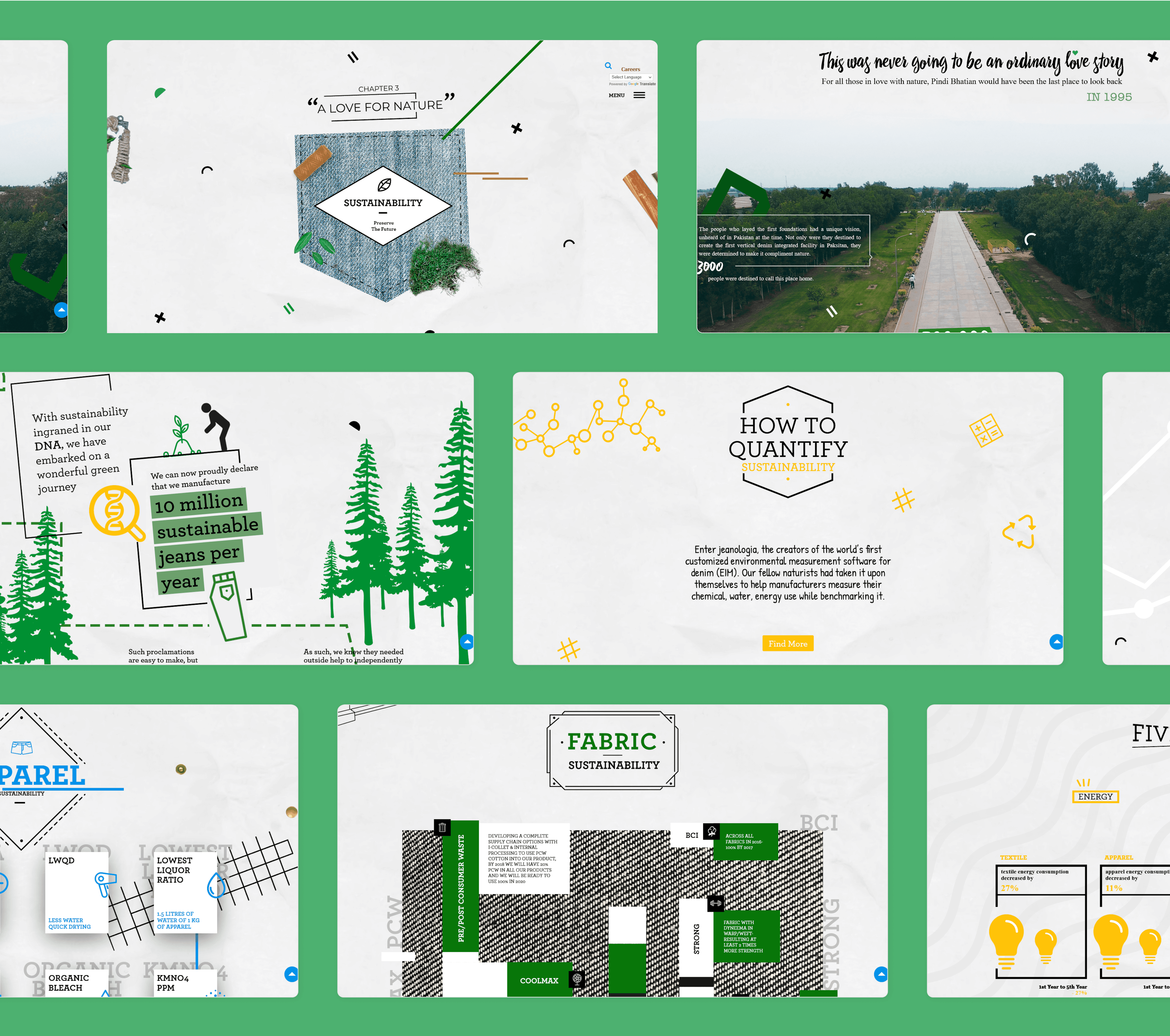
Chapter 3 - A Love for Nature
Using artwork to show greenery, different icons and instruments used to show a care for nature. We created this chapter mindfully.The copy displayed a lot of facts for this section. They needed to be highlighted through placement. The Archer font was used because it chimed the most with their logo. The design to show sustainability was modelled around the architecture of their facility.
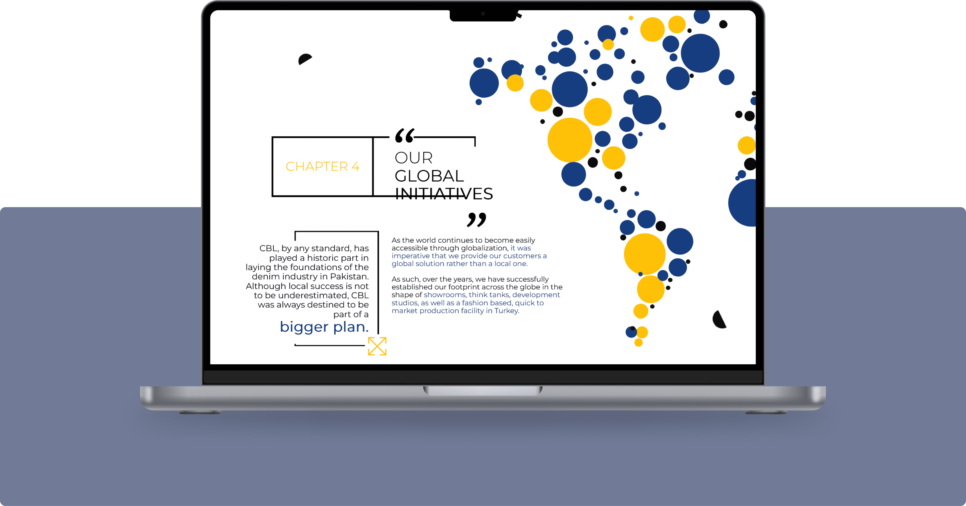
Chapter 4 - Our Global Initiatives
Circular icons that represented countries and shaped like the subcontient was created to add art and visual graphics for this section.Because the copy was pretty big for this section we needed to break the monotony which we did using different font sizes, justifications and placement of key text.

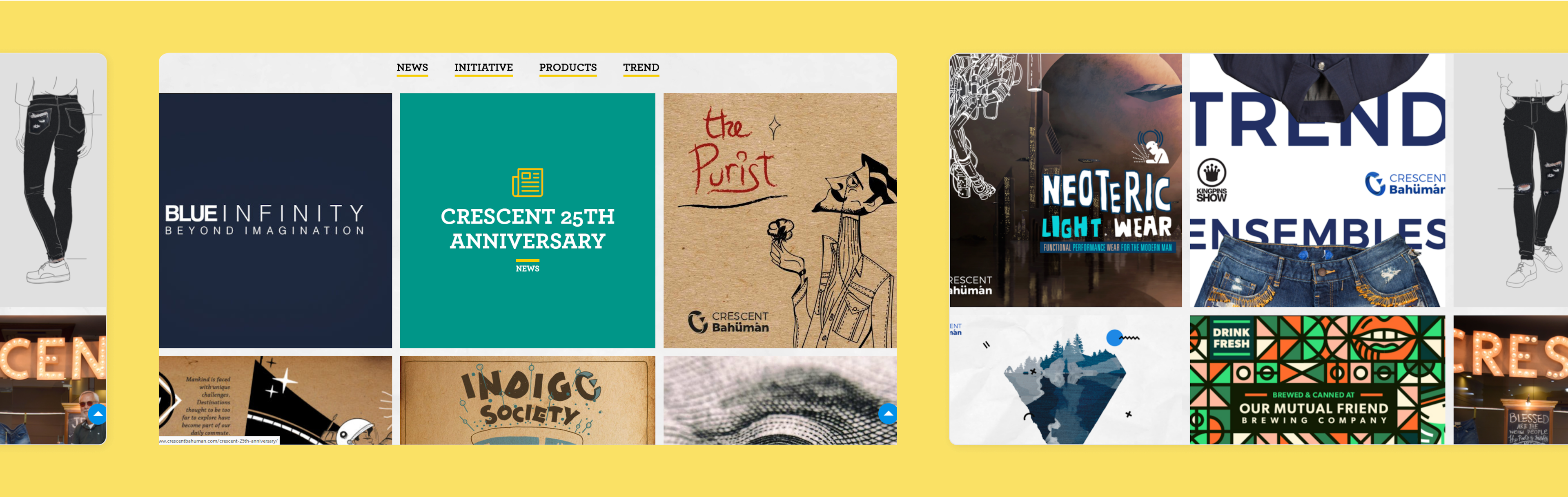
Chapter 5 - News
The section about News that they had over the years and any that they might have in the future needed to look hip and up-to-date.The different sections, within this chapter were created to organize the news and direct the viewer to their section of interest. Making it further into tiles that could be clicked and read on - the experience was curated for the reader with an artistic flair in mind.


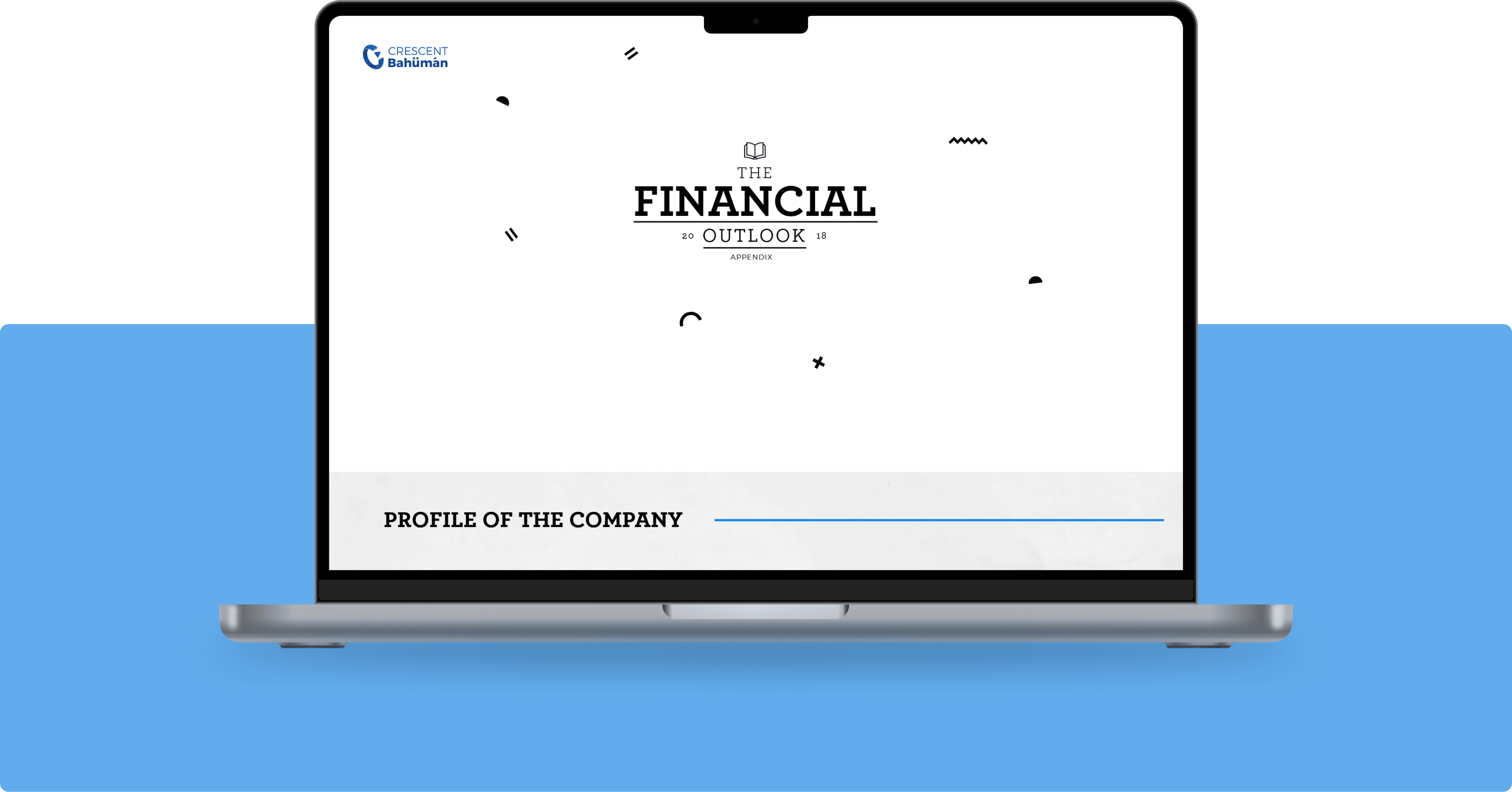
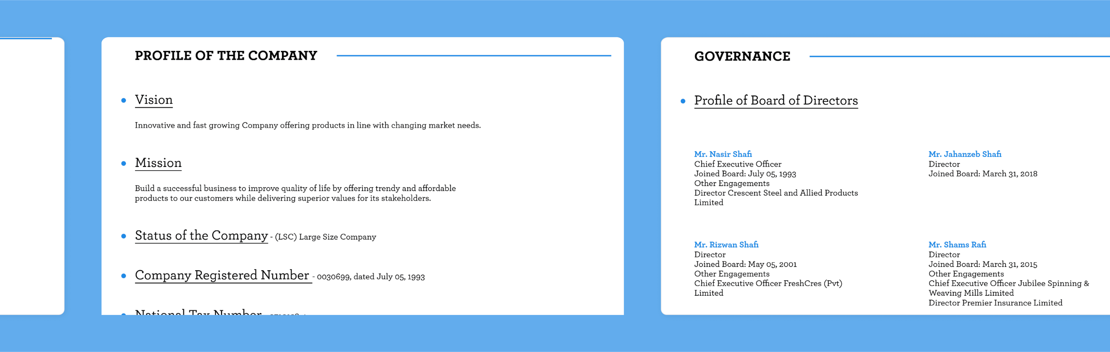
Chapter 6 - Financial Outlook
Whereas all other pages were created with an artistic bent - this section is created to showcase hard data.They wanted to create a section without any bells and whistles which displayed their financial information inn style and completion. And that’s a wrap!